


Judge
A visit to the National Print Museum, some favourite book covers, and a reading update

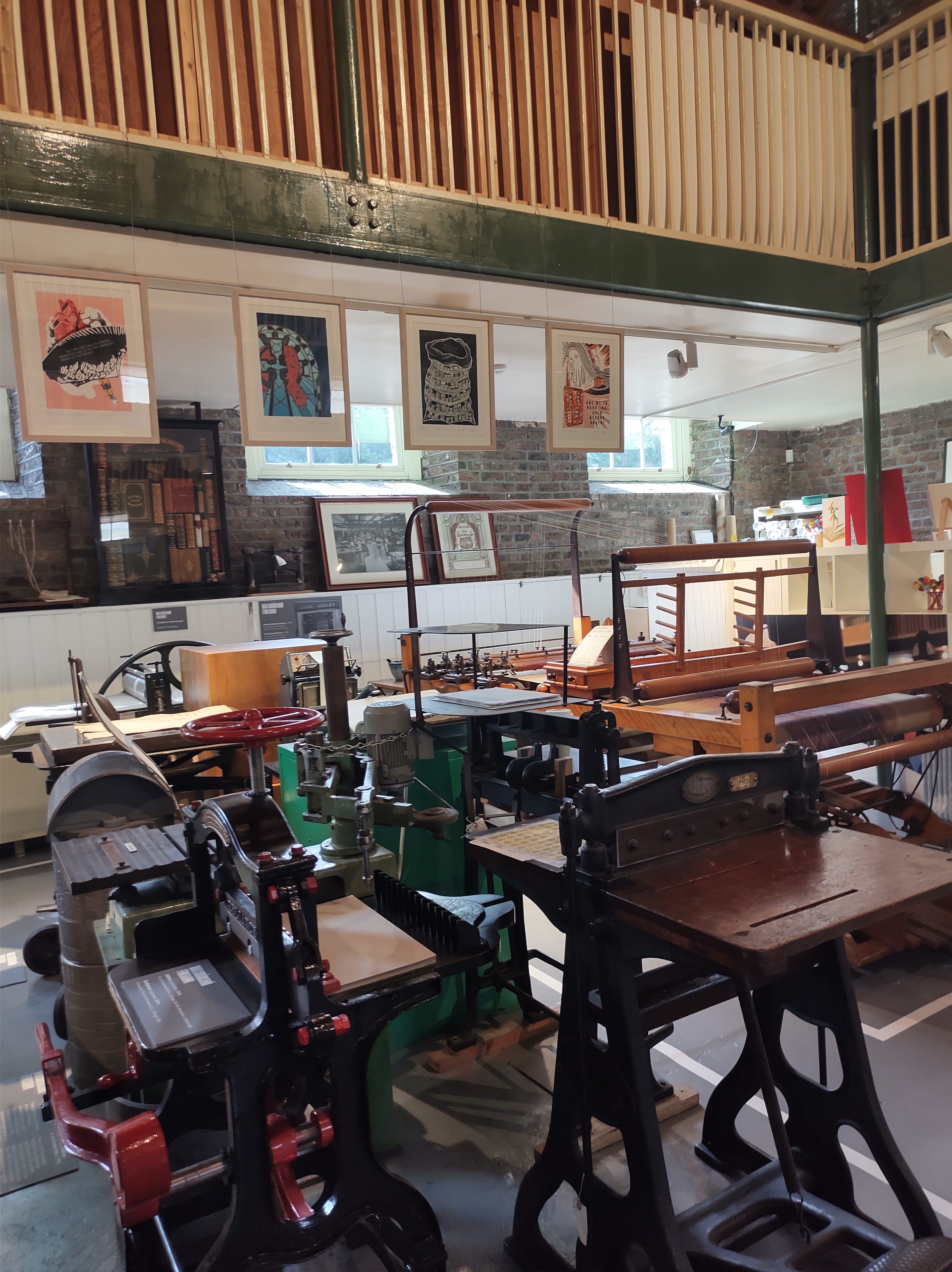
Hallo, it's me, Laura King. I had the pleasure this week of visiting the National Print Museum in Dublin. I went on a short tour organised by my workplace (quite funny to have gone with them, my first non-book related job as an adult) and my only complaint was that the tour was not nearly long enough for me. However, entry is free to the museum so I'm sure I will return to wander at my leisure soon.
The museum is situated in an old Army barracks and it also has a really pretty café with lots of lovely cakes, even if the history of print isn't your thing. The museum has printing and typesetting equipment dating from the 17th Century (including replicas) with many or all of them still in working order. We were brought from the early Gutenberg Press to the printing of the proclamation in 1916, noting the innovations along the way and really appreciating the craft that has always gone into typesetting and printing. For me this was especially interesting because of my background in print production. I didn't know much of this history but I found it could be easily applied to what I know of modern methods, and even these old machines reminded me a little of the large scale, high tech industrial printing house I had visited in a previous role.
I'm really passionate about the amazing work creative,design and productions teams do in book publishing, as well as being so impressed by the highly skilled printing, binding and finishing work we don't always know enough about to appreciate. I know everyone says “don't judge a book by its cover”, and obviously that's good advice to not solely judge the content of the book on the physical appearances, I do think it's a very real factor in catching the reader's eye. I think this has become even more important in the age of digital formats, too. Where once people were quite rightly worried that no one would ever buy physical books when e-Books could be sold cheaply online, as it has turned out the situation for print publishing isn't that dire. Some people have obviously moved over to digital formats completely but there are some who only read physical copies, or those like myself who mix in both. If I really like a book I've read on e-Book or audiobook, I will sometimes buy myself a copy, but the urgency with which I will do this 100% depends on the cover, since I've read it and am kind of buying it as a collectors item anyway.
When so much money and talent goes into the physical appearance of books, I think it's good to appreciate that. Katy Conneely, host of All About Books on Dublin City FM recently posted to her instagram (@whatkatythoughtnext) a selection of books and their cover designers, reminding me that I always mean to credit the designers when I post a book cover, so I'm trying to do that again now when I can on Instagram, where the cover is what you see first in any book review. We all know how annoying it is when a book you love has an ugly cover, or when you feel like the design of the cover misleads you into thinking it would be a whole different genre, or it just doesn’t suit the content or the writing and the whole tone seems disjointed.
I wanted to spend some time this week highlighting some great cover designs and production choices. I should note here I used to work on some of the areas I’m mentioning, and while I draw on technical knowledge I used to use everyday I’ve tried to ensure that any of the comments I’m making about the books or publishing are observation only and not “insider” info - not that I think I have any anymore. I've never worked on any of these books but I would have been very happy to!
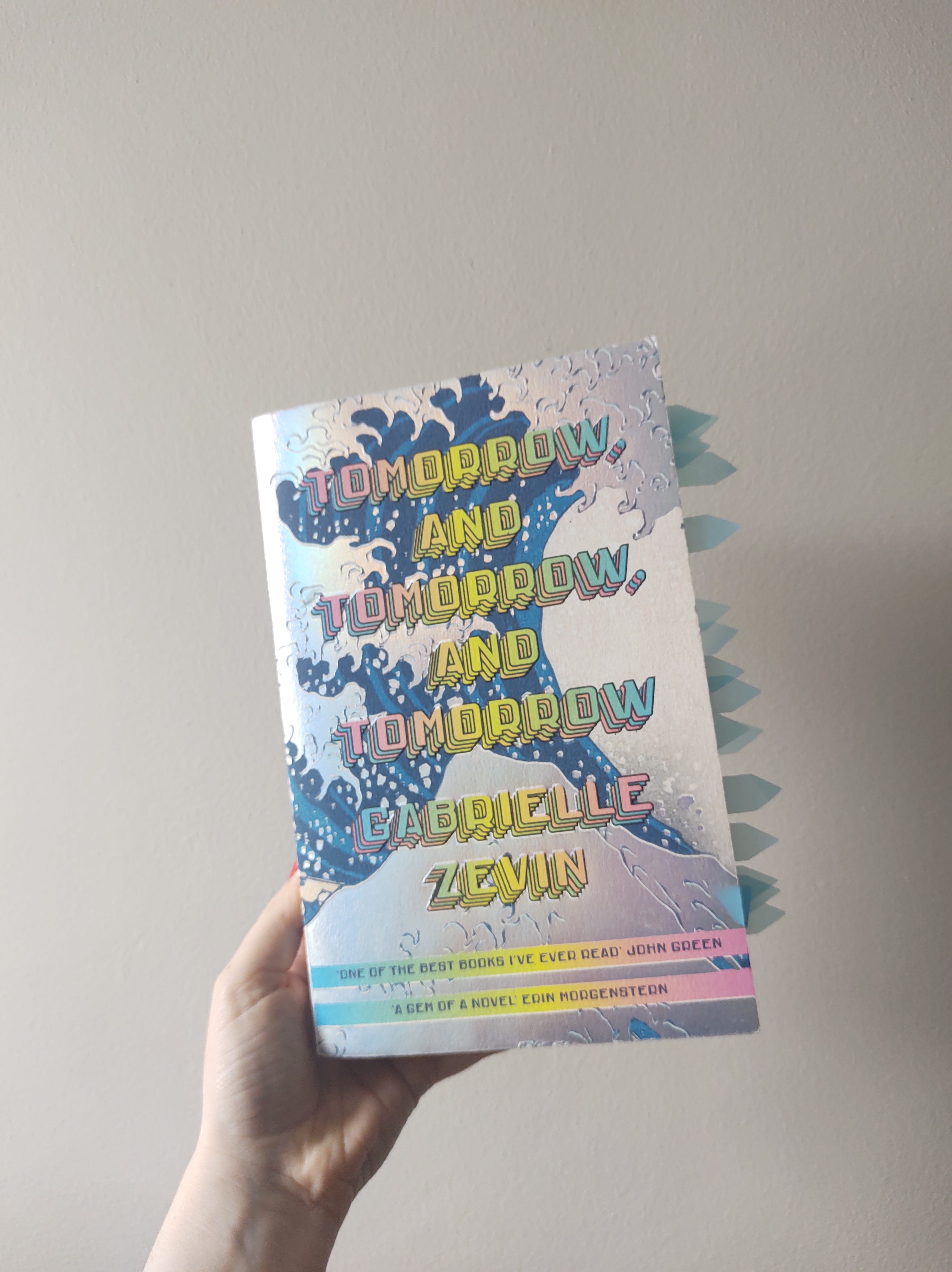
I'm going to just be honest and say I bought Tomorrow and Tomorrow and Tomorrow by Gabrielle Zevlin based on the absolutely stunning holographic foil cover (designed by John Gall), and they seem to be creating even more innovative and eye-catching editions now. If you're able to watch this reel, it's fascinating to see how they created the effect on the coloured edges to alternatively read “Sadie+Sam” and “Sam+Sadie” as you flick through the pages (though personally I found it hard to make out the lettering when I saw this new paperback in shops). It’s really cool how quickly things are changing - I was already plenty impressed with regular sprayed edges!
For reference, my (battered) copy of the 50th anniversary edition of Valley of the Dolls by Jaqueline Susann (design by CHIPS) was one of the first books I owned with sprayed edges, and while the pink has faded substantially in the eight years since I purchased it, you can see how it really adds to the glossy, brassy glamour of the novel. I’m usually not a fan of a gloss laminated cover but, again, it works here along with the very flashy gold foil on the title. You can’t see it here, but the foiling goes over the lamination to make it really bling-y, whereas a subtler effect can be achieved by laminating over foil. They obviously went all out with flashy finishes here (it was probably guaranteed to sell a lot of copies), but the little pink dots are a clever part of the cover design to symbolise the pills, or “dolls” that give the novel the name, and don’t require splashing as much cash!
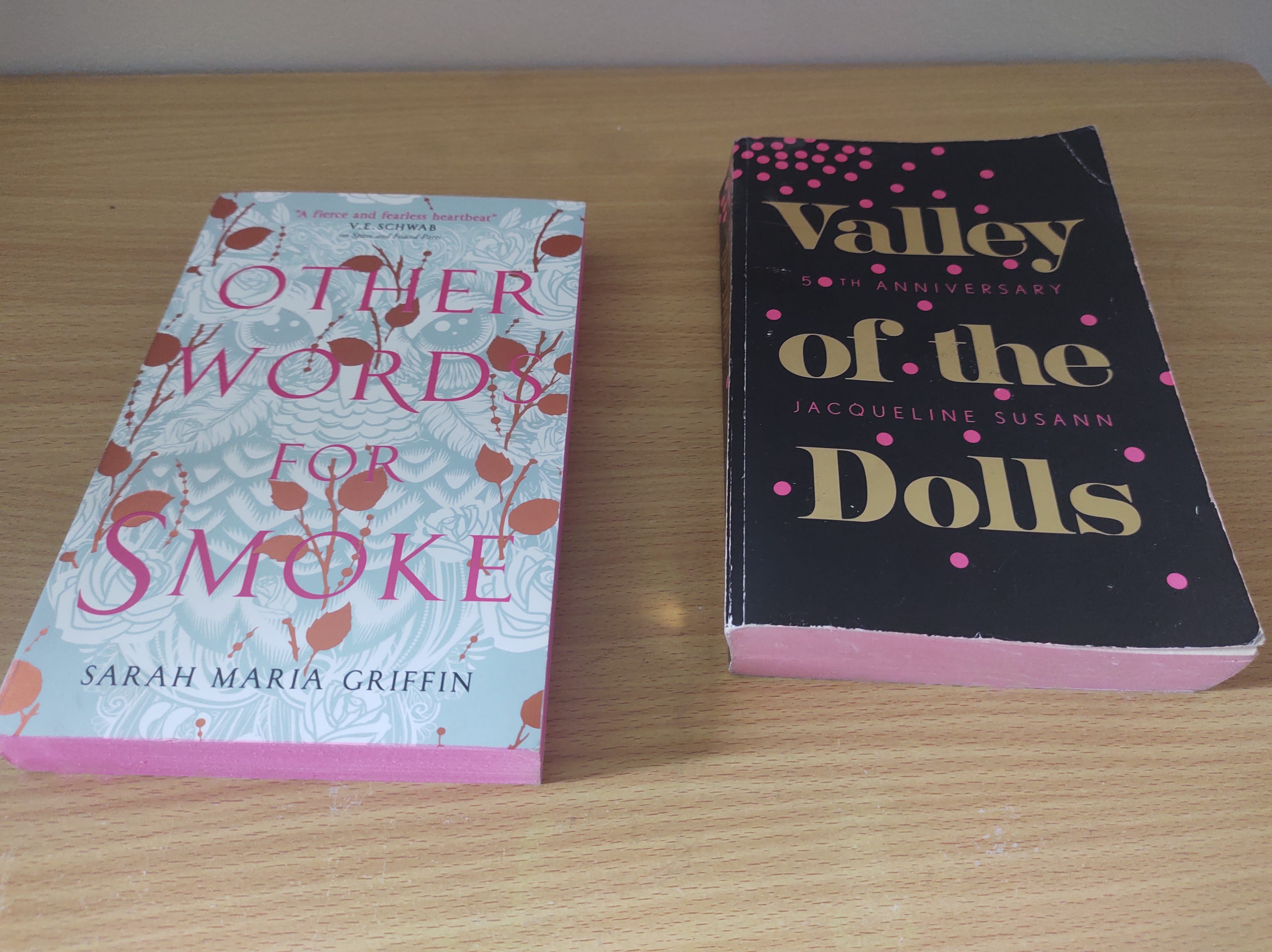
You can also see the lovely pink sprayed edges on this copy of Other Words for Smoke by Sarah Maria Griffin (design by Julia Lloyd), but what I like about this cover is how the finishes aren’t “the point”, exactly, but they’re incorporated in the design to give the effect of layers. Sometimes, the bronze foiled leaves appear to be “above” the pink lettering, sometimes behind, and beneath all that is the shaded figure of Sweet James, who lurks behind the old wallpaper in the novel.
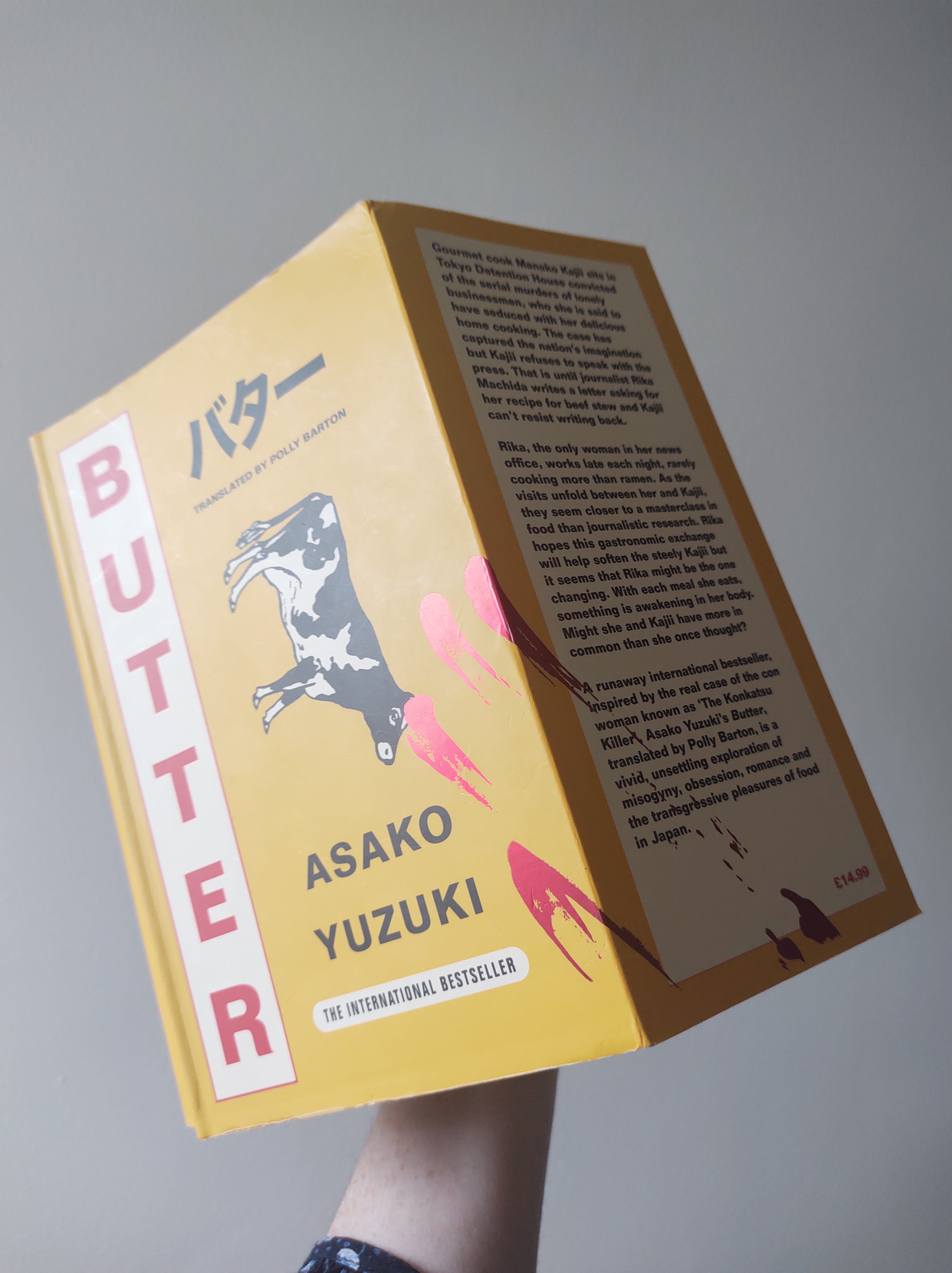
Still on foil, I had to give a mention to my most recent read, Butter by Asako Yuzuki for the really eye-catching design by Emma Pidesley. I actually didn’t realise there was foil on this cover, first, and I was obsessed with the striking red, white and yellow cover design that looked like it was food packaging, until you see what looks like bloody fingerprints - but those prints are actually foiled in red, but in really fine detail continuing over the “edge” of the cover on to the french flaps. I feel like people think they have to go all out to get their money’s worth out of a finish, but using something like foil on a detail, instead of the type, almost always feels more considered to me.
Having said that, I don't think you always need all those fancy finishes in order to catch the reader's eye, and all that noise can be a distraction from a great design. I was going to use David Pearson’s design for the 2013 Penguin edition of Nineteen Eighty Four by George Orwell as an example of one of my favourite book covers of all time, and then while sourcing a picture I found this fascinating article about it. The concept is brilliant; it uses the vintage Penguin Books design and colorway but uses large black blocks to censor out the title and author’s name, which I’ve always thought was a stroke of genius considering that the novel is about a totalitarian regime that censors thought, let alone speech or publishing. I always felt that if you’ve read the book (or heard of it, probably) you’d know what novel it was right away without having to check the back cover. However, I never realised that the blocks on this edition fade over time and reveal the censored content underneath - as this article says, the book becomes “less censored” over time. Huge if true!!
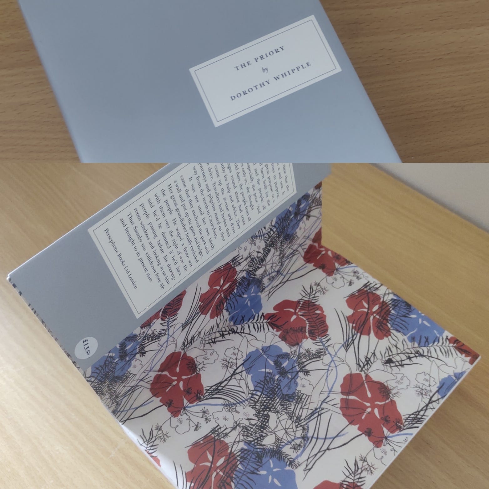
I’m a huge fan of books published by both Persephone Books and Fitzcarraldo Editions, and the writing they publish is of such a high quality that I barely need to read anything about the work itself before buying, because that quality is already assured. I love that they don’t go in for flashy covers, and the “understated” designs give the impression that the packaging doesn’t matter itself, it’s only the writing that counts. However, this is such a clever branding move because it means that the very similar looking covers themselves feel timeless or iconic, not following a trend, as such.
Both publishers use paperbacks with french flaps, and seem to have consistent typesetting inside. Books from Persephone are always grey with white text boxes on the front cover and flaps, but the printed inside cover (like endpapers on a hardback) comes from a different pattern everytime, and I always think that this is what their books feel like - they sound old fashioned or “plain”, but the content is so vibrant and unique. They are all a consistent size, like a demi paperback (216x136mm) but a little wider, making them seem to look a bit square. This means they stand out from the other books on your shelf, but those in-between sizes generally are more expensive for the publisher and do lead to paper wastage so they aren’t always favoured.
Fitzcarraldo books are always true demi paperbacks, with french flaps on uncoated cover boards (they feel textured to the touch as they are varnished, not laminated) and a subtle embossed logo. They are either white with navy type, and navy inside cover printing, or navy with white type and white inside printing (my preferred version, as you can see on this photo the white board shows up more marks), and what is probably a very easy print order for their production staff makes for a really recognisable brand.

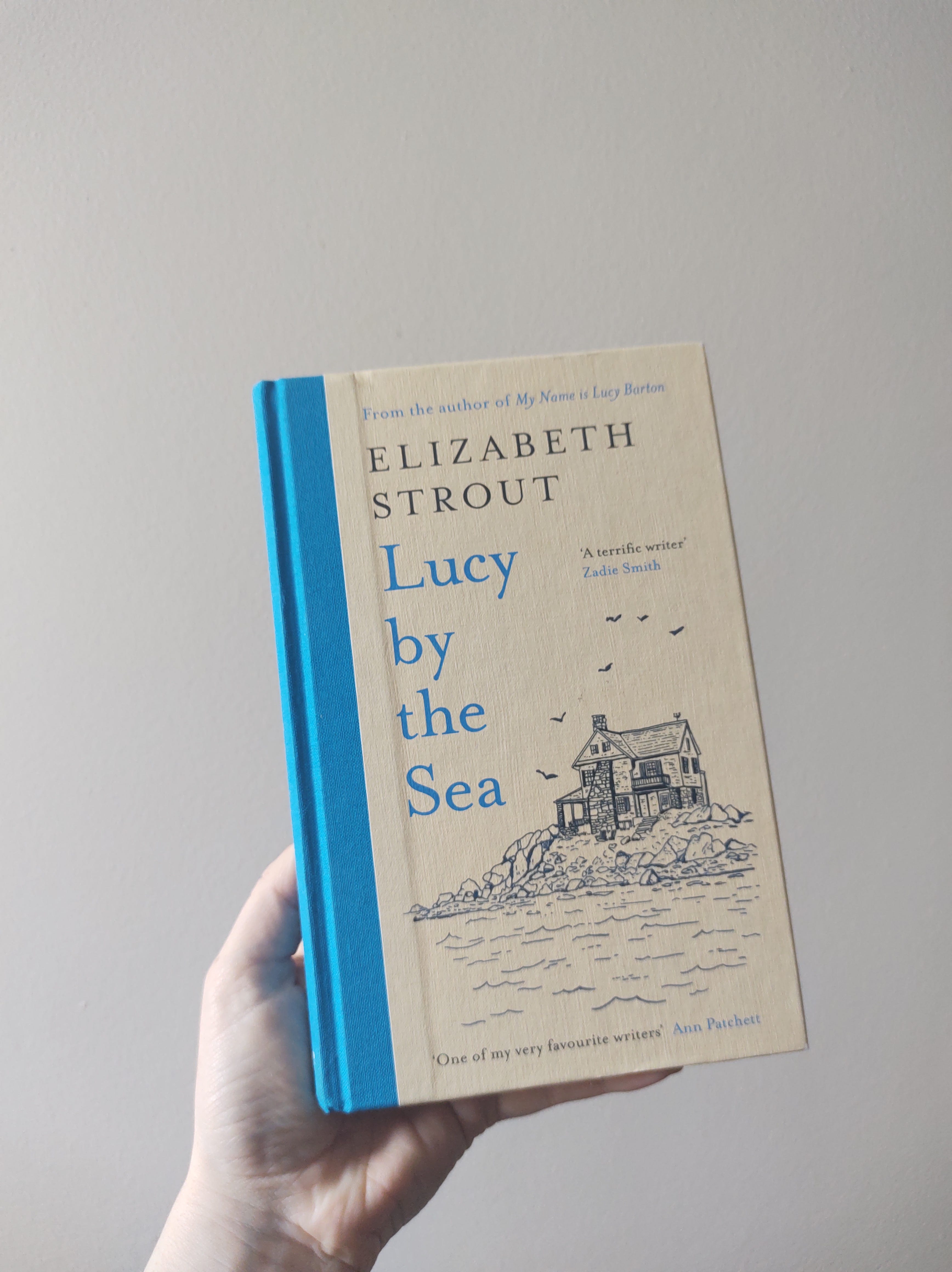
Even within a series, branding is very important, and I think Elizabeth Strout and Richard Oseman’s books (designers not available for these, very annoying) have a brilliant series feel. Even when the colours are changed, I know a Thursday Murder Club book on sight, and while I love the hardback (cased with a embossed jacket) editions, which have gorgeous endpapers and silver foil blocking on the linen case material, the design works just as well.

Equally, I love the hardback versions of Elizabeth Strout’s books, where the textured case itself is printed and varnished with a gorgeous linen quaterbind. However, that effect is also very well translated on the paperback covers, where there’s a sort of quaterbind effect achieved with a block colour printed on the spine.
I am a sucker for a quaterbind, and for a printed case, which is probably why I treasure my copy of the Dishoom cookbook so highly. I’m annoyed I don’t have it to hand to take pictures, but you can see the outside here, and the inside is printed on really luxurious uncoated (not glossy) paper with the colouring on the photographs feeling very like the lighting at their beautiful restaurants. The illustrations also add to the feeling of care and attention on every page, and it’s a book to pour over as much as to cook from (the recipes take fecking aaaaages to cook). It’s one to place carefully on your shelf, whereas other recipe books that are meant to be used everyday are usually covered in loads of food stains (just me?), with glossy pages that allow the photographs of food to be really vibrant, and can either be hardback for durability or paperback for ease of passing around to friends and family.
Finally, I also don’t have any of my copies of Laura De Barra’s books to hand (funny, as I originally intended to mostly talk about these and the Dishoom book) but I love my copy of Gaff Goddess as well as the same-but-different looking Garment Goddess which are as supremely chic as they are supremely practical. I wish I could show you the inside pages, complete with DeBarra’s own illustrations, but I think the interior design in both cases is even cooler than the cover (and I’ve found them both extremely useful). These make such good presents, or coffee table books, and also feel like your most knowledgeable and grown up friend is imparting absolute gems to you.
Reading Update
Physical book: I just finished Butter by Asako Yuzuki (translated by Polly Barton) right before writing this, and while I found the pacing and length a challenge there is so much here to think about, particularly about cultures around bodies, food and feminism, and I’m glad I read it. I’m about to reread The Spinning Heart by Donal Ryan because…
e-Reader: I read the first few pages of Heart, Be At Peace by Donal Ryan the other night but realised I remember absolutely nothing about these characters, and I want to really appreciate it. This sequel comes out next week and I’m delighted to have had an early go at it!
Audiobook: I’m wandering through time and place with Maggie Shipstead’s Great Circle, a long read but a really interesting one - I’m just finding it difficult at times to keep track of the detail on audiobook.
Thank you for reading, and I hope you join me next week for a new instalment of LauraEatsBooks... Lost.